 By LUDWIG VON KOOPA - Honestly not just nostalgia.
I fondly remember the days of sprite comics back on the Nintendo NSider Forums. But that's not the real reason why I find the SNES and GBA graphics (and some DS spritework too) to be the best graphics videogames have to offer. ...I don't really know how to explain it, but it's what's in-between the pixelated blocky crap that indies relish in these days, blocky polygonal crap that no one really likes, and the hyperrealism of today's games that keeps getting only marginally better with every new hardware generation. Here we had STYLE. Artistic FLAIR. And you didn't have to worry about clipping or anything that polygon models suffer for today. So below I'm going to provide some comparison screenshots to support my assertions: A lot of games from yesteryear look better than their predecessors and their successors.
Okay, how about the
Pokémon Mystery Dungeon series? Let's compare
Explorers of Sky to
Gates To Infinity.
 |
| Kinda good models, although they caused the camera to be quite zoomed in. |
 |
| Crisp spritework and backgrounds. |
You really gotta note how
The Spriters Resource loves Mystery Dungeon 2.
The sprites in that game are pretty much made for being definitive work for sprite comics, just like with
Mario and Luigi: Superstar Saga. I mean, you don't really gain anything by having 3D models for this game.
Let's next compare
Fire Emblem: The Sacred Stones to
Fire Emblem: Shadow Dragon. You know, the DS had a lot of titles where the sub-title could be abbreviated as "DS".
Shadow Dragon seems to have gotten the letters mixed up, though.
Shadow Dragon was apparently trying to go for a
Castlevania kind of look and it looks terrible.
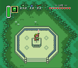
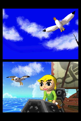
The game transition that really inspired this article was from The Legend of Zelda: A Link to the Past to The Legend of Zelda: A Link Between Worlds. This also applies to The Legend of Zelda: The Minish Cap vs. The Legend of Zelda: Phantom Hourglass. Let's tackle one at a time.
Apparently
A Link Between Worlds has been
getting FANTASTIC reviews, but even so, we at KoopaTV think it visually looks like shit.
 |
| I mean, this just doesn't look endearing to me. |
 |
| Here's a classic moment. |
"Hey Ludwig, there's nothing actually WRONG with the
A Link Between Worlds graphics to me!" You might be saying. "That's just your personal preference!" And you can pull things up like this:
 |
| I was one of those people. |
But... Uh...
Fine, look at this shit.
 |
| "HEY GUYS LOOK AT MEEEEE!" |
 |
| "LOOK LOOK I'M A HERO!" |
 |
| This is very, very crisp. Good. |
 |
| This just looks spectacular. |
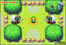
Which one of those do you think truly is the graphical successor to the wonderful art style of
Wind Waker? Clearly
Minish Cap. Crisp sprite graphics will always be better than shitty polygon models. Obviously,
Wind Waker itself is polygonal, but it's far from shitty! There's a difference between being obsessed with low-resolution textures and being horrified at
Phantom Hourglass. I'm not obsessed with that at all, but man, that game looks bad.
Minish Cap and
Four Swords Adventures look MUCH better than either
A Link To The Past or
A Link Between Worlds, by the way.
 |
| Clearly inspired by A Link To The Past, just like A Link Between Worlds is. Except this isn't hideous at all. |
One more comparison.
 |
| It's crisp, but that colour palette isn't what I'd call good. |
 |
| Bright, crisp, beautiful. Perfection. |
 |
| For some reason, everyone looks fatter. More troubling, the style is inconsistent. Yoshi and Baby DK are redone/new, while the Ukikis are taken from the SNES game. |
So yeah, that's of
Super Mario Bros. 3,
Yoshi's Island,
Yoshi's Island DS, and
Yoshi's New Island.
Graphical taste is a pretty difficult thing to put to paper. It's far from a science. As graphics become better and better, is it more and more difficult to justify 16 and 32-bit as the best graphical style?
I already conceded that cel-shaded is the best graphical style. So maybe you're wondering which I like more:
Wind Waker's graphics or
Minish Cap's, since they're both based on cel-shading.
...Honestly, my answer is
Minish Cap. Don't get me wrong.
Wind Waker, especially
HD, looks INCREDIBLE. And you should get it. ...But... I don't really know. I just like sprites more.
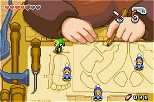
Like, I like
Mario & Luigi: Superstar Saga visually more than
New Super Mario Bros. U.
 |
| When am I going to end this article? |
 |
| I'm currently actually playing this game, as you can see on Miiverse. |


.png)


-15.jpg)


No comments :
Post a Comment
We embrace your comments.
Expect a reply between 1 minute to 24 hours from your comment. We advise you to receive an e-mail notification for when we do reply.
Also, see our Disclaimers.
Spamming is bad, so don't spam. Spam includes random advertisements and obviously being a robot. Our vendor may subject you to CAPTCHAs.